Dashboard Creation & BI Reporting
Dashboard creation and BI reporting that are fast, focused, and actually used—designed with stakeholders, not just for them. Trusted by businesses across Pune and India.
Designing dashboards that drive action
Our dashboard creation and data visualization approach keeps dashboards intentionally simple: a few critical metrics, clear visuals, and obvious next steps. Every chart answers a specific question.
- Executive scorecards with drill‑downs by region, product, or segment
- Operational dashboards for teams handling day‑to‑day workloads
- Self‑service views so individuals can slice data without breaking reports
- Alerting and annotations to capture context around spikes and dips
Good dashboards feel like this
- Load quickly on any device
- Show trends, not just snapshots
- Make outliers obvious at a glance
- Suggest where to look next, not just what happened
Automyze Case Studies
Executive performance dashboard for a multi‑site business
The leadership team received different numbers from each department and struggled to compare locations.
- Aligned KPIs across finance, sales, and operations
- Built a single executive view with drill‑downs by site
- Added commentary fields so managers could explain results
Impact: more focused leadership meetings and faster identification of under‑performing sites.
We worked with each department to keep their key metrics while standardising definitions so comparisons were fair and consistent.
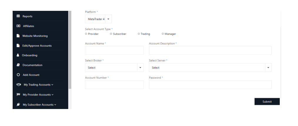
Design an executive dashboard with usCurrency Brokerage Management and Algorithmic Trading Portal
The client wanted to automate key operational functions: client onboarding, trade recording, and performance analytics.
- Python-based solution now live, supporting hundreds of customers
- High-frequency trade copy feature to offer and subscribe to trading strategies
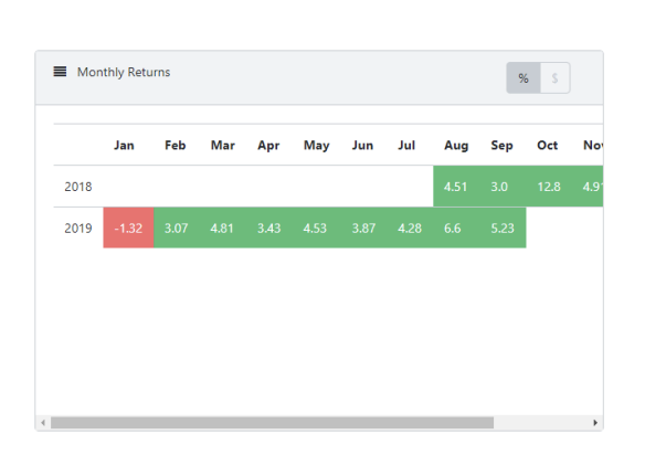
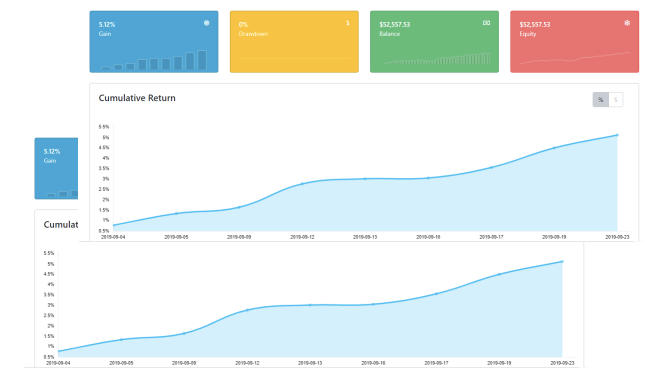
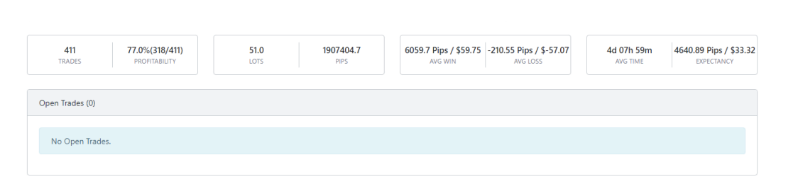
- Performance evaluation using MT4 Manager Data
Impact: streamlined brokerage operations and data-driven strategy evaluation for providers and subscribers.
Automyze delivered a Python-based solution which is now live and supports hundreds of customers. The solution was later extended to include a high-frequency trade copy feature that allows clients to offer and subscribe to trading strategies and evaluate performance using MT4 Manager Data.
 Discuss a dashboard for your brokerage
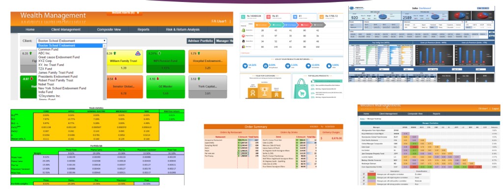
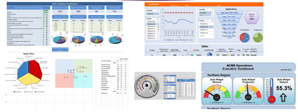
Dashboards and Analytics Across Industries
We have designed and built dashboards for wealth management, sales, e‑commerce, web analytics, and operations—each tailored to the client’s KPIs and workflows.
- Wealth management and portfolio views with client and risk analysis
- Sales dashboards with category, region, and product filters; order and delivery tracking
- Web analytics, funnel charts, and application workflow views; operational gauges and executive summaries
Impact: clear, actionable views so teams can spot trends and act quickly.
From wealth management and portfolio correlation analysis to sales performance, e‑commerce returns, and operational KPIs, we deliver dashboards that combine the right metrics with the right visualisations—pie charts, bar charts, gauges, funnel charts, and interactive filters—so stakeholders get a single place to monitor and act.
 Discuss a dashboard for your business